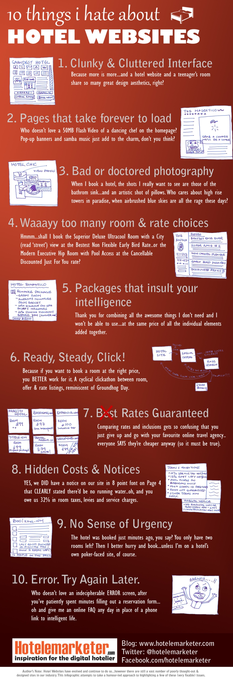
Here’s a cheeky look at what’s wrong with so many hotel websites out there…most of these issues are elementary and fixable…all that’s required is some forethought and keeping users top-of-mind.
Click here to open the infographic in full size (to download, right-click on the link and use Save As)
Leave a comment and let us know what you think about these pet peeves…and share your own!


Info graphic was excellent Jitendra and points you mentioned are also great but I would differ a little with point number 4 as these are for customer’s facility. They can choose what suits them keeping in mind the location as well as cost.
LikeLike
Thanks Sara – I agree with you that a variety of clearly understood choices are ideal for our customers. What I find amusing are hotels which create artificial room types and rate categories for the express purpose of creating incremental rate levels…rather than focusing on real value for the guest. The naming conventions used can sometimes get really ambiguous too 🙂 Add all this together and the choices just become confusing clutter. Simplicity demands that a guest be able to pick a room (understanding what it offers via text & photography/video), choose the most suitable rate and quickly wrap up the booking process…what do you think?
LikeLike
Exactly Jitendra, instead of creating artificial categories they should keep focus on real value of client, if they failed to do so then what they can get from those artificial categories:)?
LikeLike
Love this – hilarious!
LikeLike
Excellent Jitendra, but uhm, what about a contact page here?
LikeLike
Thanks Guido – good suggestion, was hoping the last item covered that one, but it probably deserves a pet peeve of its own! 🙂 Hope you’re well btw…it’s been ages since we connected! Rgds, JJ
LikeLike
There are some pages too with a lot of nice pics, info and good prices, but not visible phone or email in the contact page !!!
LikeLike
Thankfully we have none of these problems! Definitely hate the urgency aspect too…let customer’s make purchases at their own pace, this isn’t Armageddon!
LikeLike
Hotel Websites are usually painful and complected with lots of stuff. We simply check pictures, room rates, review and then decides whether we want to plan or not.
Most websites lack this simple fact.
LikeLike
Love it! Particularly the one about useless packages.
LikeLike
Just found this blog. Great advice in this graphic!
Clunky and cluttered interfaces are the biggest problem we see with hotel sites. Keep it simple, and choose only the 1 or 2 items to draw the user’s attention on each page (a big photo and button to book your reservation). Everything else should be secondary.
LikeLike
i don’t hate , but i also don’t like hotels website .
all these ten tips are right , but all of people ignore these problems .
so , i like these hotel websites that contain true stories .
http://www.comfortmaingate.com/
LikeLike
Congratulation! A very good Articel. Kind of funny and in so many points true. Hopefully you like this Webpage of a 5 Star Hotel in Zurich more: http://www.thedoldergrand.com/en.html When we designed it, we tried to not follow your 10 adwises!
LikeLike
Thanks a lot sara you are right they should keep focus on real value of client.
once again thank you for these 10 things…..:)
LikeLike
I absolutely agree with Happy Hotelier above about the extreme importance of a Contact Us page!
This is especially true for small and independent places to stay such as B&Bs that do not typically have online booking systems. The most important tip I offered in my blog post “Booking Contact Form – Let Me Count The Ways…” is to offer both a clickable email address (handy for smart phones) AND a contact web form. That way your hotel site supports computers, tablets, and mobile devices whether at home, work, or while traveling.
http://www.bookingcounts.com/trust-travel-services/booking-contact-more-than-one-way/
-Scott, BookingCounts – Tourism Website Optimization
LikeLike
Pingback: Sito web dell’hotel: 10 errori (comuni) da evitare
I just ran across this, and #4 is definitely one of my biggest pet peeves. This worst part IMHO, is when hotels have all of these different packages and then do a poor job communicating room availability.
LikeLike
These problems exist in small undeveloped websites, I think serious companies have worked that out long ago
LikeLike
Pingback: What a meeting planner wants in a hotel website | Fully Committed
Very good write-up. I certainly appreciate this site. Thanks!
LikeLike
Hmm it looks like your site ate my first comment (it was extremely long)
so I guess I’ll just sum it up what I wrote and say, I’m thoroughly enjoying your blog.
I as well am an aspiring blog writer but I’m still new to the whole thing. Do you have any tips and hints for newbie blog writers? I’d definitely appreciate it.
LikeLike
Jitendra: This is a fantastic infographic. I wanted to introduce my company to you: It is called INNsight.com. I’d love to share what we are doing for hotels because we are trying to solve alot of the problems your blog is dedicated to. A hotel website Powered by INNsight is becoming a powerful tool for hoteliers to sell more rooms, direct. Check us out at http://www.innsight.com/aboutus. We’d love your support. Follow us @INNsight and we should get together to discuss how we can enable hoteliers to take control of their internet marketing.
LikeLike