OpenAI dropped something big yesterday.
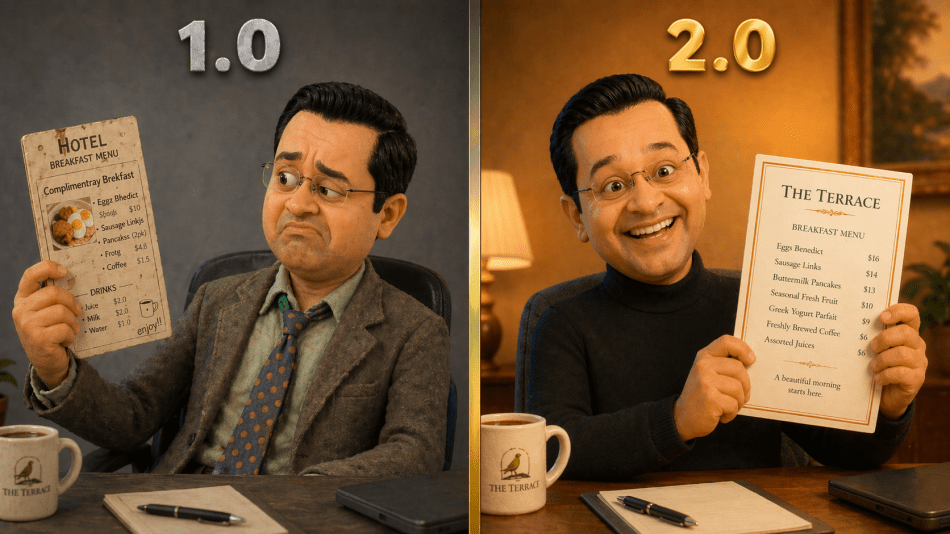
ChatGPT Images 2.0 isn’t just another incremental upgrade to AI image generation. It’s the kind of leap that made me cancel my evening plans, fire up a dozen experiments, and write this post instead of eating dinner. For anyone who’s tried getting an AI to generate marketing collateral and ended up with “Complimentray Brekfast” on a poster, this one’s for you.
Here’s what changed: the new model can actually think before it creates. It researches, plans, self-corrects, and produces images at 2K resolution with text that’s, well, spelled correctly. It handles multiple languages, generates consistent sets of images from a single brief, and works in practically any aspect ratio you throw at it.
I watched the full launch (available above, if you’re interested), several deep-dive videos from tech reviewers, and then spent the evening testing it with prompts designed specifically for hotel marketers. What follows are the seven capabilities I think are worth your time, each demonstrated with a real experiment you can try yourself.
1. Text That Finally Spells Things Correctly
Let’s start with the one that matters most for anyone who’s ever tried to generate a restaurant menu, event poster, or lobby sign with an AI tool.
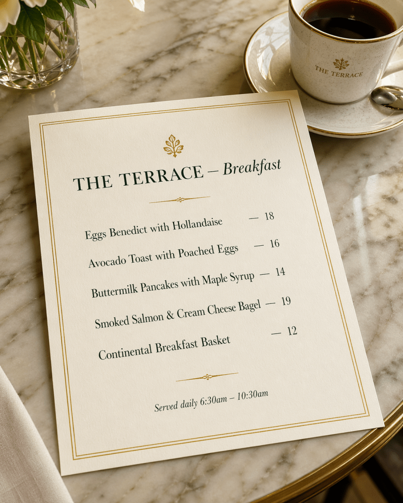
I asked it to create a luxury hotel breakfast menu card for “The Terrace.” Five items, five prices, serving hours. Clean typography, gold border, cream card on a marble table.
Every single word: correct. Every price: aligned. “Eggs Benedict with Hollandaise.” Not “Eggz Bnedict” or “Hollandase.” The serving times read “6:30am – 10:30am.” It even branded the coffee cup in the background with “THE TERRACE” without being asked.
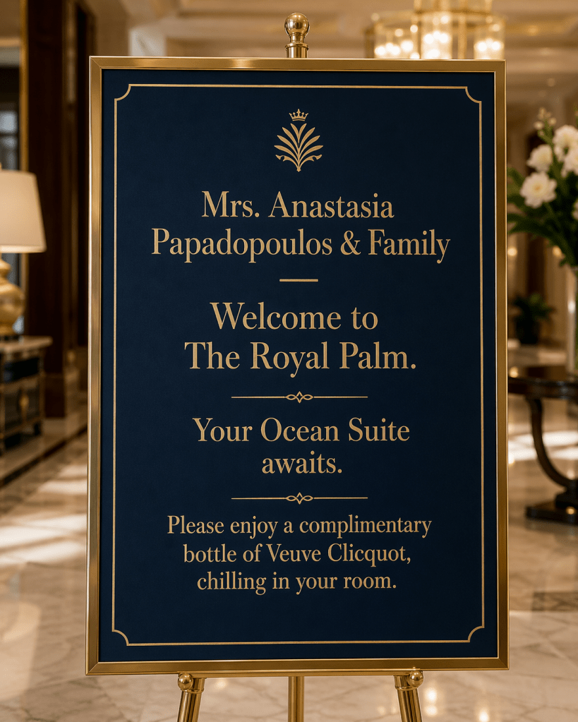
Then I pushed harder. A personalised lobby welcome sign: “Mrs. Anastasia Papadopoulos & Family — Welcome to The Royal Palm. Your Ocean Suite awaits. Please enjoy a complimentary bottle of Veuve Clicquot, chilling in your room.”
It nailed the Greek surname, the ampersand, and (crucially) “Veuve Clicquot” spelled perfectly. (Would a real hotel display all this in the lobby for everyone to see? Of course not. Hotels are far more discreet than that. But as a demonstration of what the text engine can handle, it’s a convincing stress test.)
Try it yourself: Give it your actual hotel’s breakfast menu or spa treatment list. See what comes back.
2. Multilingual Welcome Cards (Your International Guests Just Got Noticed)
Hotels are one of the few industries where you might need to communicate in six languages before lunch. So I tested exactly that.
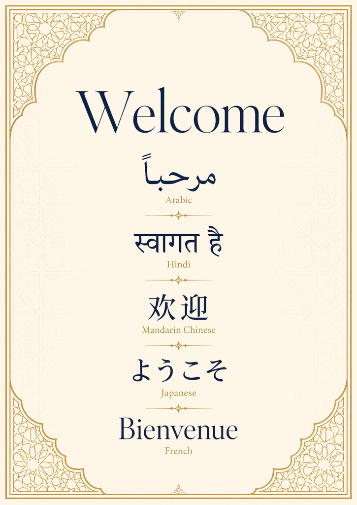
I asked for a luxury welcome card for a Dubai hotel featuring “Welcome” in English, Arabic, Hindi, Mandarin Chinese, Japanese, and French. Each in its native script, clearly labelled, with geometric patterns inspired by Arabic architecture.
The Arabic rendered right-to-left. The Hindi Devanagari script was clean. The Chinese and Japanese characters were accurate. The French was, unsurprisingly, fine. The design felt appropriate. Warm, international, luxurious without being overdone.
I followed up with a Japanese ryokan welcome poster: “心からのおもてなし” (Heartfelt Hospitality) in brush-stroke calligraphy with an ink wash landscape and cherry blossoms. The result looked like something you’d find framed in a Kyoto guesthouse, not something an algorithm generated in thirty seconds.
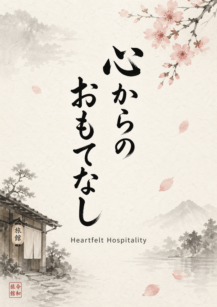
The hotel angle: In-room welcome cards in a guest’s native language. Multilingual signage for properties with international clientele. Localised social media content for your source markets. The capability is real. Just make sure you get a native speaker to verify before anything goes to print. AI confidence and AI accuracy aren’t always the same thing.
3. The AI That Thinks Before It Draws
This is the paradigm shift.
Previous image models were pattern-matching machines: describe something, get something back, hope for the best. Images 2.0 has a “Thinking Mode” that researches, plans, and self-corrects before generating. For hotel marketers, this matters when you need something specific and real, not just generically pretty.
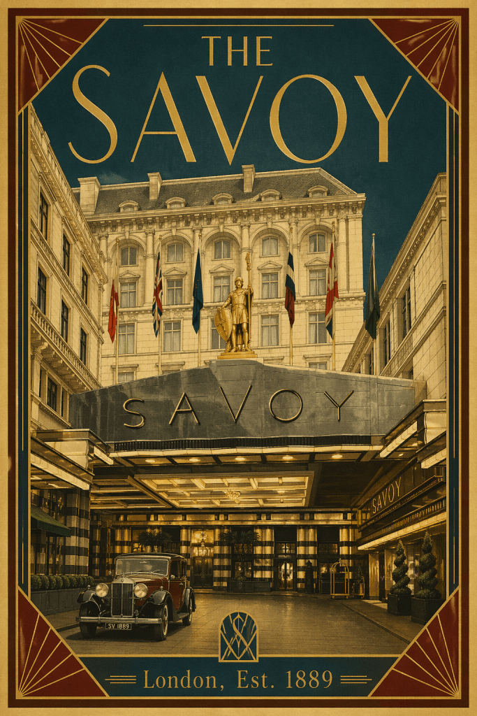
I tested it with a vintage 1920s Art Deco travel poster for The Savoy in London. The result with Thinking Mode on was striking: period-appropriate typography, the correct founding year (1889), a facade that captured the hotel’s architectural character, vintage cars, international flags, and that unmistakable entrance canopy. It felt like something you’d find in an antiques market, not a ChatGPT window.
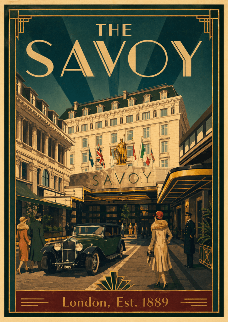
I ran the same prompt with Thinking Mode off. Still impressive, still Art Deco, still beautiful. But the architectural details were slightly different. A little more invented than researched.
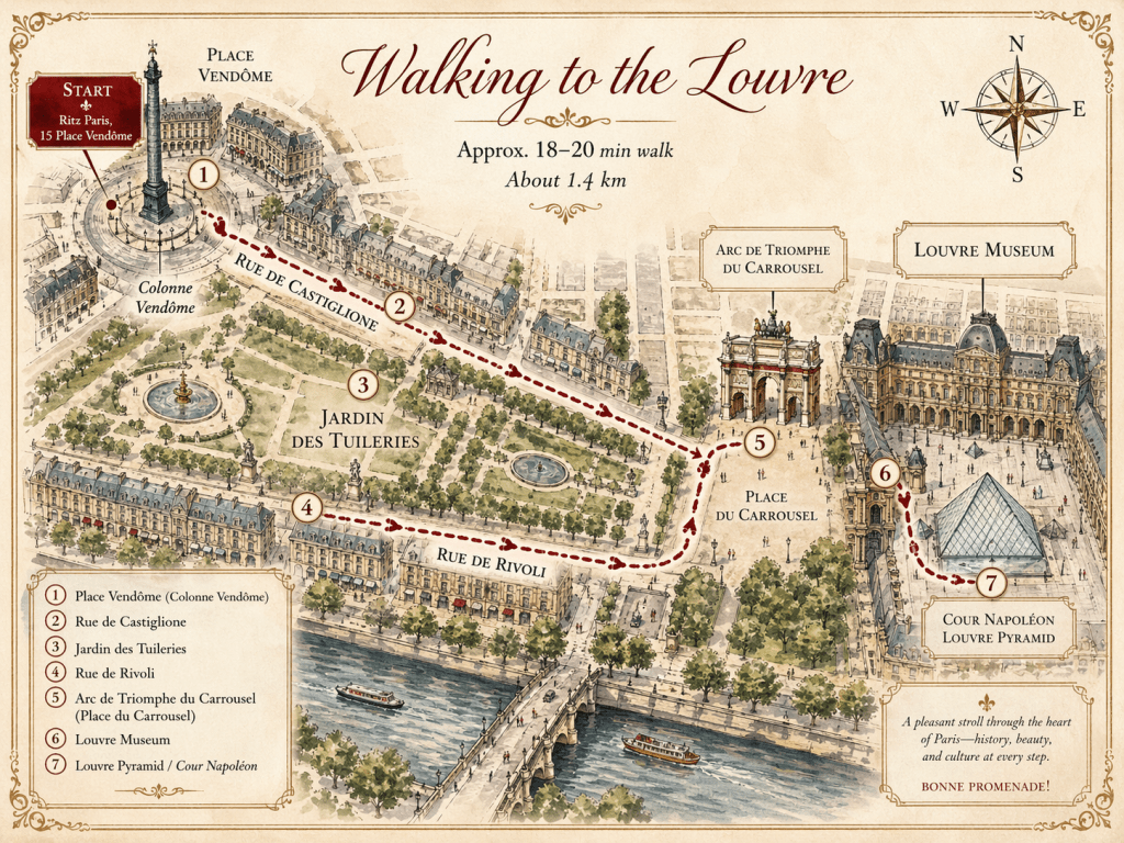
Then I gave it something harder: a hand-drawn concierge walking map from the Ritz Paris to the Louvre Museum. This is where my jaw genuinely dropped. It produced a watercolour-style illustrated map with real street names (Rue de Castiglione, Rue de Rivoli), actual landmarks (Place Vendôme, Jardin des Tuileries, Arc de Triomphe du Carrousel), numbered stops, a compass rose, “Approx. 18-20 min walk, About 1.4 km,” and finished with “BONNE PROMENADE!” in the corner. The route is geographically plausible. A concierge could almost slip this under a guest’s door.
Almost. You’d still want to verify every street name and landmark placement. But as a starting point? That’s a two-hour design job compressed into a prompt.
Try it yourself: Pick a real hotel you know well. Ask for a vintage travel poster. Compare Thinking Mode on and off. The difference tells the story.
4. One Brief, Four Seasons of Content
Small hotel marketing teams live in a permanent state of “we’ll design that next quarter.” This feature might actually change that.
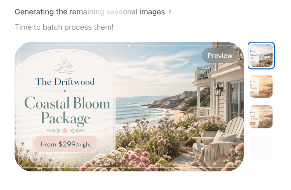
I asked for four seasonal promotional graphics for a fictional boutique coastal hotel called “The Driftwood.” Spring, summer, autumn, winter. Different imagery and pricing for each, but consistent branding, typography, and design language across all four.
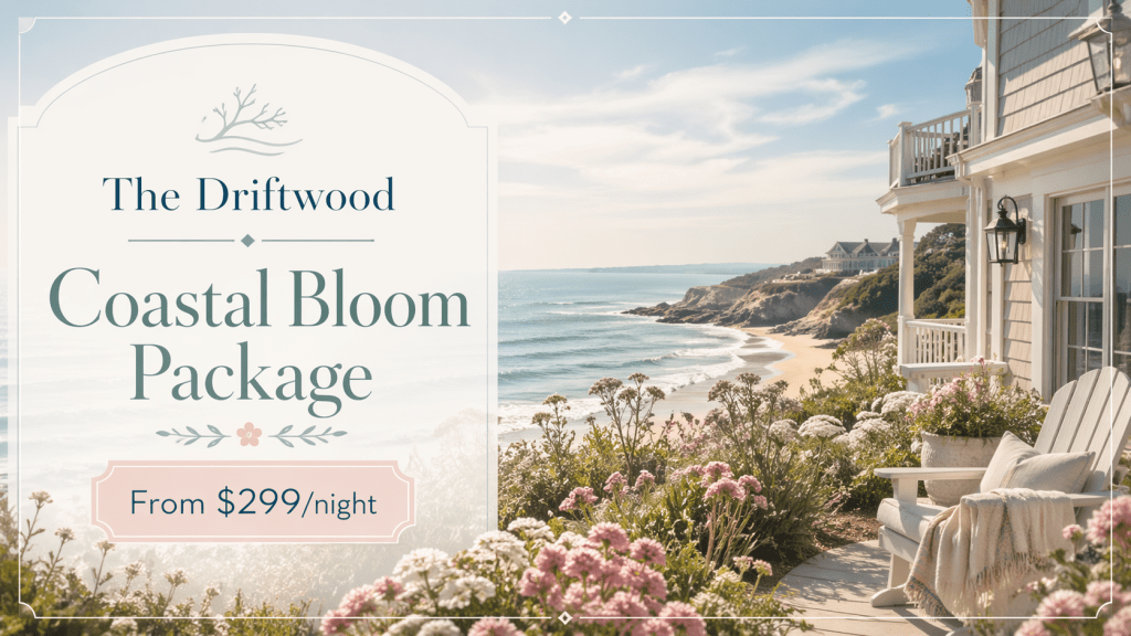
The results maintained “The Driftwood” wordmark consistently, used the same branch logo on each, and the visual identity held across seasons. The pricing rendered correctly. Could you post these directly? With minor tweaks, probably yes. Would they win a design award? No. But for a property that needs social content by Friday and doesn’t have a designer on retainer, this is a genuine shift.
5. Every Aspect Ratio, One Prompt
This sounds boring until you remember that every marketing channel has its own dimensions. Website hero banners, Instagram feed, Instagram Stories, email headers, OTA listings, lobby digital signage. Each one needs a different shape.
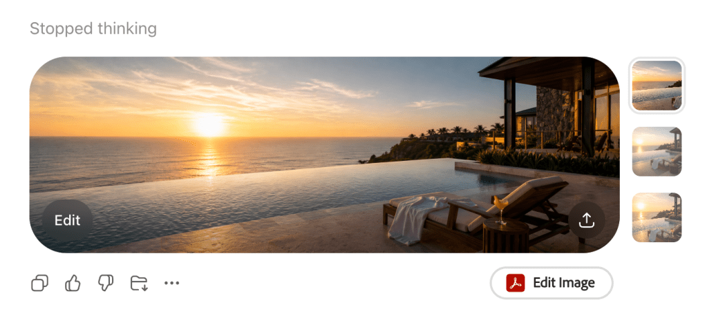
I generated a luxury infinity pool scene at sunset in three aspect ratios: ultra-wide 3:1 (website banner), square 1:1 (Instagram feed), and tall 9:16 (Stories). The scene adapted intelligently rather than just cropping. The composition shifted to keep the pool, lounge chair, and cocktail as focal points in each format.
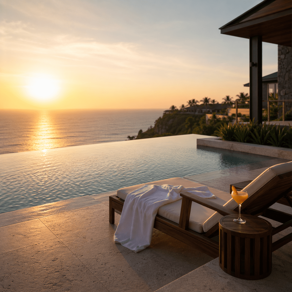
One concept, three formats, zero Photoshop. For properties managing content across a dozen platforms, this alone might be worth the subscription.
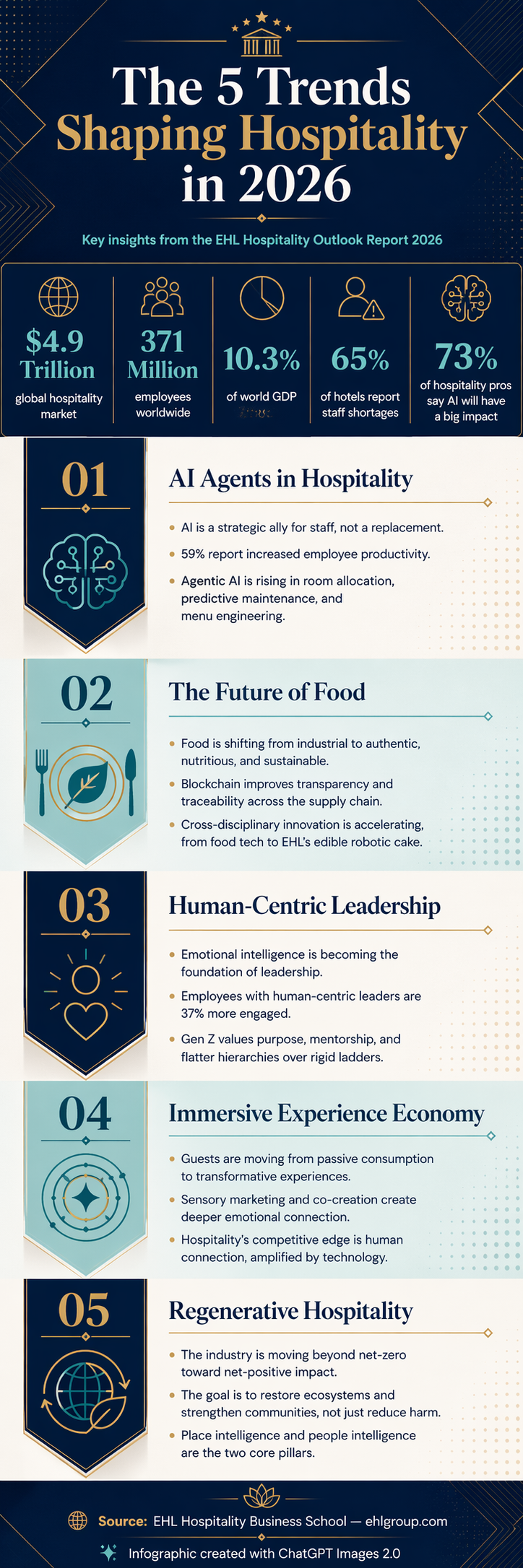
6. From 34-Page PDF to Visual Infographic
This was my most ambitious test. I fed it the EHL Hospitality Outlook Report 2026 (a real, 34-page industry report covering five major trends) and asked it to create a single vertical infographic summarising the key findings.
It produced a clean, professional infographic with the correct headline stats ($4.9 trillion market, 371 million employees, 10.3% of world GDP), five colour-coded trend sections with accurate bullet points, appropriate icons, and proper source attribution at the bottom. The text was readable, the hierarchy was clear, and the data was correct.
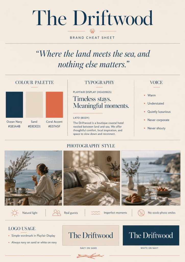
I also tested a brand cheat sheet, feeding it colour hex codes, font names, voice guidelines, and photography style notes for a fictional hotel brand. The output included actual colour swatches, typography samples, logo usage variants, and the tagline rendered beautifully. It’s the kind of one-pager a new marketing hire could genuinely use on day one.
The hotel angle: Turn your brand guidelines PDF into a visual reference card. Convert a conference agenda into a shareable graphic. Summarise a competitor report for your leadership team. The model can read, synthesise, and visualise dense information in ways that save hours.
7. QR Codes (Trust, But Verify)
This was my “wait, seriously?” experiment. I asked it to generate a QR code linking to hotelemarketer.com, embedded in an elegant restaurant table card with “Scan for Our Full Menu & Wine List” above it.
The card looked perfect. Cream background, dark green serif text, “The Terrace Restaurant” below the code. You’d put it on a table without hesitation.
So I scanned it.
It worked. Straight to hotelemarketer.com. First try.
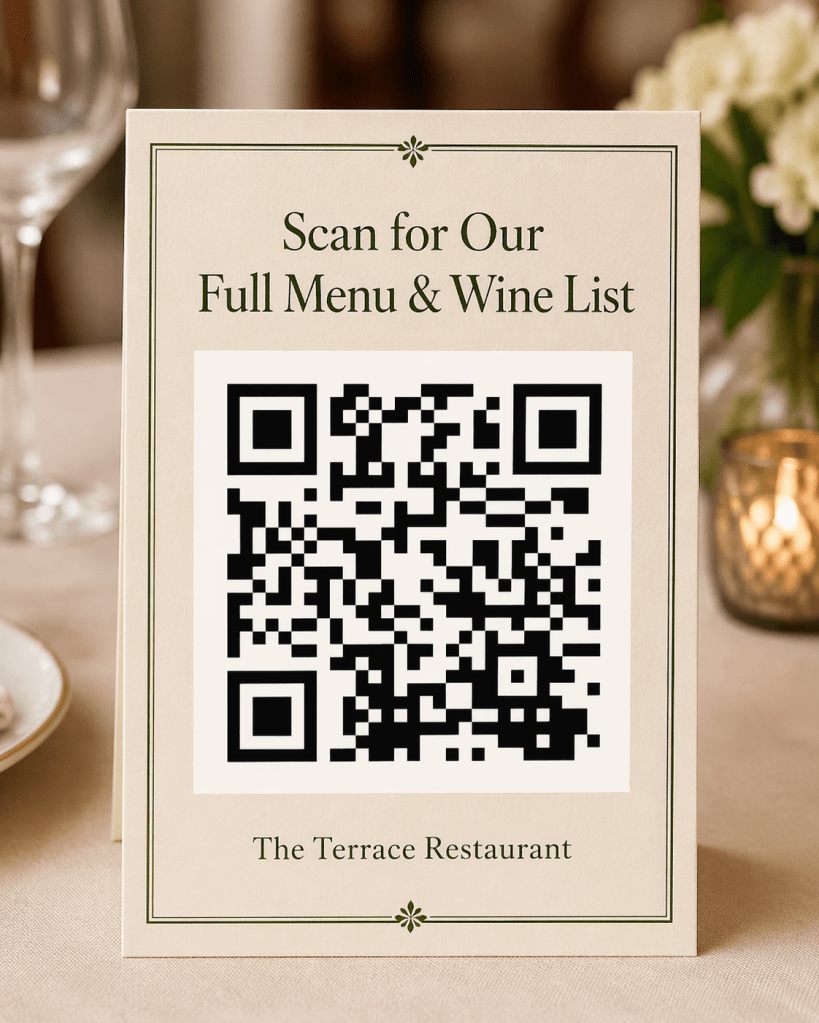
I’ll be honest, I didn’t expect that. A QR code is binary. It either works or it doesn’t. There’s no “pretty close.” The fact that an AI image generator can now produce a functional QR code, embedded in a designed table card, from a single prompt, is the kind of thing that quietly changes what’s practical for a small marketing team.
That said: would I print 500 of these without scanning every batch first? Absolutely not. It worked this time. It might not next time. Trust the capability, verify the output.
Which brings me to the part that matters most.
The Part Where We Talk About Doing This Right
These tools are impressive. They’re also easy to misuse if you’re not careful.
Don’t use AI-generated images to misrepresent your property. That infinity pool needs to actually exist. Don’t generate multilingual signage and assume it’s correct. Get a native speaker to check. Don’t put AI-generated QR codes on 500 table cards without scanning every batch first. And don’t create images of real guests or staff without explicit consent.
The capability is real. The responsibility is yours.
On the commercial side: OpenAI’s current terms appear to say you own the images you generate and can use them commercially, including for marketing, ads, and merchandise. That’s the good news. The caveat is that purely AI-generated images may not qualify for copyright protection under current law, meaning you can use them freely but you can’t stop someone else from using a similar output. For anything that becomes a core brand asset, that distinction matters. Your legal team and your company’s own AI usage policies should have the final word. And if you’re operating across borders, check local regulations too. The rules aren’t the same everywhere.
AI image generation just went from “interesting experiment” to “useful production tool.” The gap between what’s possible and what your competitors are actually doing is still wide open. But that window won’t last forever.
These seven features are available right now. You could try every single prompt in this post tonight. The question isn’t whether this technology is ready. It’s whether you are.
Every image in this post was generated using ChatGPT Images 2.0 from the prompts described. No editing, no Photoshop, no designer in the loop. Just a prompt, a Wednesday evening, and a curiosity that wouldn’t quit.
Discover more from Hotelemarketer by Jitendra Jain (JJ)
Subscribe to get the latest posts sent to your email.

JJ, this is a brilliant breakdown of ChatGPT Images 2.0. The use cases for hospitality are huge, especially for quick campaign mockups and visualizing seasonal concepts before executing them.
One workflow I’ve found incredibly useful to run alongside standard text-to-image models is modifying existing property assets. While generating from scratch is impressive, hotels often need to keep the exact architectural layout of their rooms, dining areas, or lobby while just changing the lighting, seasonal decor, or overall style. Text-to-image models can sometimes hallucinate structural details that don’t match the actual property.
For this, integrating a dedicated Image to Image AI tool bridges the gap perfectly. Instead of relying purely on text prompts and hoping the AI gets the room right, you can upload your actual hotel photography and guide the edits. Acting as a flexible ai image creator, it allows you to take a base photo and reshape, expand, or restyle specific elements without losing the original identity and layout of the property.
This photo to photo ai approach is especially helpful when you need to adapt a single hero shot for different OTA platforms, social media formats, or seasonal email blasts without organizing an entirely new photoshoot. Have you experimented much with image-to-image pipelines alongside ChatGPT for maintaining that strict brand and property consistency?
LikeLike